A Fresh Start
/Interior Design by Cindy McCord | Written by Terri Glazer | Photography by Ross Group Creative
Their nest was empty and their home was new—it seemed like the perfect time for a complete redo. Interior designer Cindy McCord recalls that the owners wanted their recently constructed Germantown home to have a totally new environment. “They didn’t bring any furniture with them from their previous place; they started fresh. She wanted a light, simple, airy and timeless feel.”
Built by Tayloe Company, the transitional-style residence has plenty of curb appeal thanks to its painted brick exterior. From the first step into the entryway, the design tone is set, a look McCord calls “coastal casual elegance,” that flows throughout the house. Crisp white walls play off handsome hardwood floors in a perfectly medium stain; not so dark as to be imposing, but dark enough to anchor an otherwise cool palette. A traditional style chest in an updated finish—distressed blue/gray—sits beneath a subtly antiqued mirror to form the focal point. A large original painting of a tranquil landscape by Atlanta artist Thomasa Seymour greets guests as they enter the home. McCord says she chose the entryway’s Dash & Albert rug with both durability and simplicity of style in mind. Its relaxed striae pattern features flecks of neutral colors and precisely the right amount of blue.
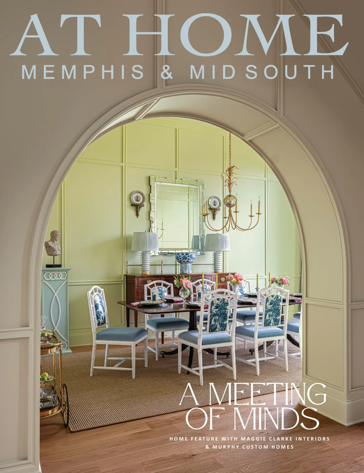
Just off the entryway, the dining room is one of McCord’s favorite parts of the house. “I love the dining room; it’s so pretty and simple,” she says. The table is dressed-up farm style with graceful curved pedestals and a soft oak finish. It offers ample seating for eight in distressed, antique-white chairs. The table and chairs are the true stars here. In keeping with the simplicity of the overall design plan, McCord put no other furniture in the space. The pared-down furniture placement and simple sisal rug allow the room’s “jewelry” to shine. The chandelier blends classic crystal features with metal in a fashionable bronzy gold finish for a look that is formal without being fussy. A grouping of six framed intaglios adds an elegant touch, while full-length custom drapes frame the room’s large arched window.
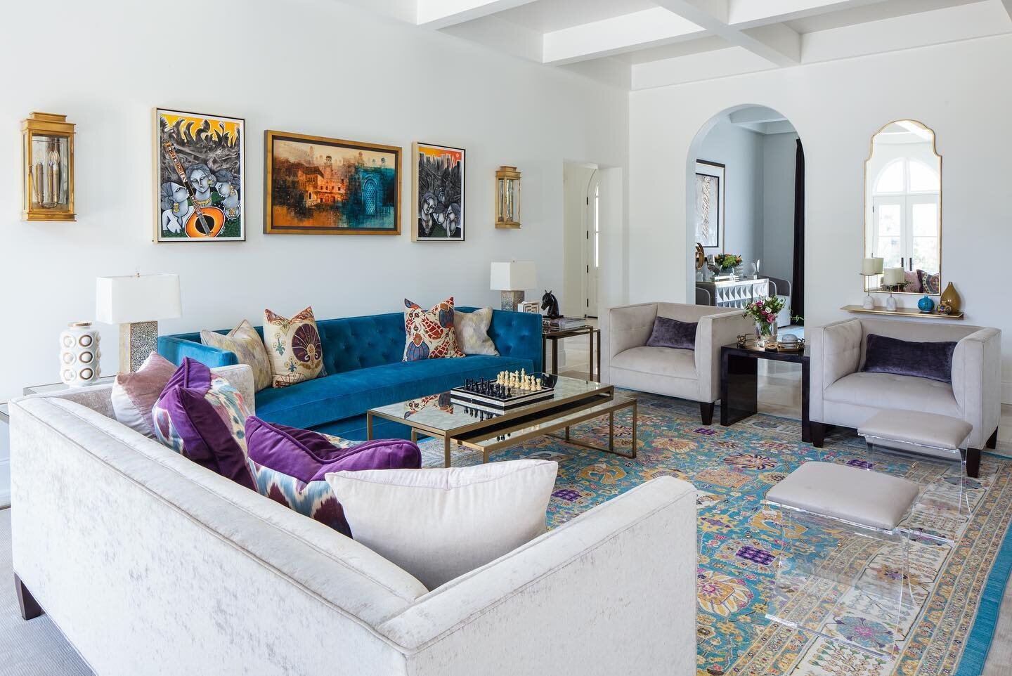
The family room gives the homeowners and their guests plenty of room to relax. A pair of handsome sofas with exposed legs and English rolled arms face each other, separated by an oversized custom ottoman upholstered in blue fabric with Greek key tack accents. Design symmetry is important here, from the twin reclining armchairs to the pairs of blue velvet throw pillows on both sofas, to the charming garden stools McCord selected in place of standard end tables. Built-in bookcases that adjoin the fireplace are backed in grasscloth in tones that echo the rich linen of the sofas.
The space opens into the kitchen, where elegance abounds. To-the-ceiling cabinets and a curved range hood draw the eye up while a pair of tall windows allow light to flood the room. Classic features like white Shaker cabinets, subway tile and quartzite countertops add to the appeal, but the kitchen is more than a pretty face. A spacious island does triple duty, holding the kitchen sink and dishwasher, providing work and seating space, and giving the homeowners sought-after storage that’s even accessible from the side and under the counter ledge that serves as a casual dining or conversation spot.
The sunny breakfast room adjacent to the kitchen is the perfect place for morning coffee or a casual lunch. For a more private feel, the homeowners can close the cleverly-placed cafe curtains on the room’s large windows.
After a busy day, the master bedroom is the ideal relaxing retreat. Simplicity and serenity were foremost in the design, McCord remembers. A light-filled nook off to the side of the room that holds a pair of chairs and an ottoman seems meant for a book and a cup of tea. Mother Nature provides a stunning view out the windows. “The house backs up to an area with lots of beautiful trees, so that nook is well used,” the designer says.
It may be one of the smaller spaces in the house, but the powder room is not to be overlooked. In fact, a picture of the half bath that McCord posted on her social media had her followers buzzing. “That room has gotten over 1,000 likes on my Instagram,” she exclaims. This is the spot in the home where she made the boldest design choices. From the custom vanity in a deep blue to the moire watermark wallpaper to the rich gold accents to the pops of orange, the room is a true showstopper.
Although it has been a year and a half since she completed the project, McCord looks back on the job fondly. “[The homeowner] approached me to help after the project had started. I was super busy at the time, but I am so glad I took it on! She was a great client and I loved working with her. We worked closely together—she trusted me and it worked out well!”


